Responsive images in Bootstrap
The same three image files are used for all instances of the images on this page. The image size is changed because the Bootstrap class makes them responsive.
Row 1: Here is a non-responsive image. Not good! Look below for the same image with the correct responsive class added to it.
Lorem ipsum dolor sit amet, consectetur adipiscing elit, sed do eiusmod tempor incididunt ut labore et dolore magna aliqua. Quis auctor elit sed vulputate mi. Enim praesent elementum facilisis leo vel fringilla. Condimentum mattis pellentesque id nibh. A diam sollicitudin tempor id eu nisl nunc mi ipsum.
Pellentesque elit ullamcorper dignissim cras tincidunt. In cursus turpis massa tincidunt dui. Suspendisse in est ante in nibh mauris. Sed risus ultricies tristique nulla aliquet enim tortor. Penatibus et magnis dis parturient montes nascetur ridiculus. Vulputate odio ut enim blandit volutpat.
Vulputate eu scelerisque felis imperdiet proin. Felis eget nunc lobortis mattis. Ultrices in iaculis nunc sed augue lacus. Dictum fusce ut placerat orci nulla pellentesque. Fermentum posuere urna nec tincidunt. Purus non enim praesent elementum facilisis leo. Diam sit amet nisl suscipit adipiscing bibendum.
Row 2: It's simple to make the images responsive with Bootstrap — just add class="img-fluid" inside the IMG tag. Each image is 1000 x 700 pixels, but the class resizes them to fit inside the surrounding element. Resize the browser window to see changes at different widths. Note, these images will get larger when the boxes go to one column!
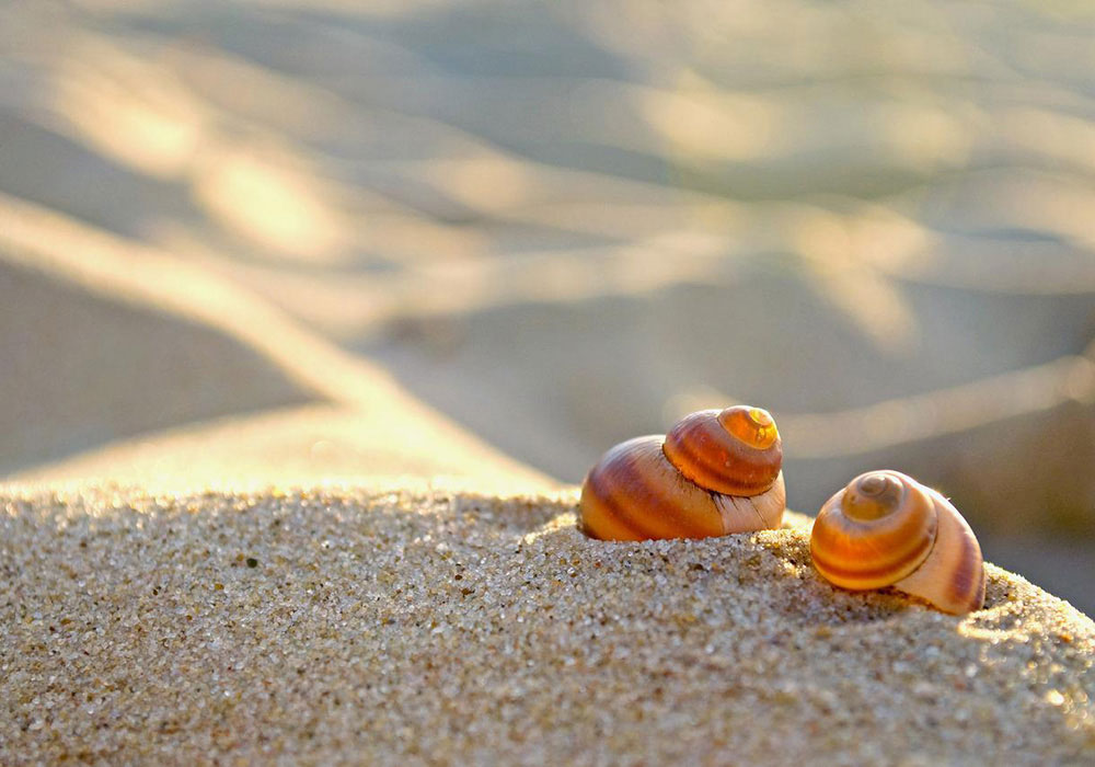
Lorem ipsum dolor sit amet, consectetur adipiscing elit, sed do eiusmod tempor incididunt ut labore et dolore magna aliqua. Quis auctor elit sed vulputate mi. Enim praesent elementum facilisis leo vel fringilla. Condimentum mattis pellentesque id nibh. A diam sollicitudin tempor id eu nisl nunc mi ipsum. Image by Rafixx from Pixabay.
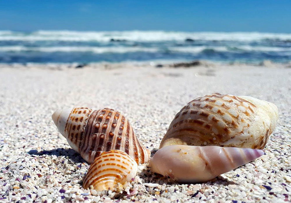
Pellentesque elit ullamcorper dignissim cras tincidunt. In cursus turpis massa tincidunt dui. Suspendisse in est ante in nibh mauris. Sed risus ultricies tristique nulla aliquet enim tortor. Penatibus et magnis dis parturient montes nascetur ridiculus. Vulputate odio ut enim blandit volutpat. Image by Liselle VD from Pixabay.
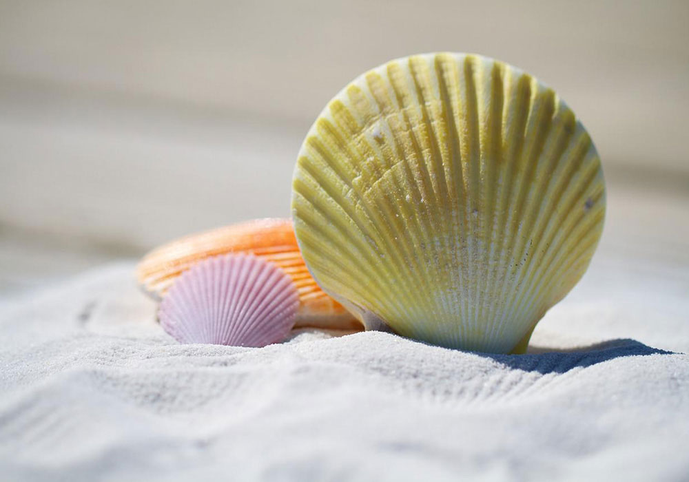
Vulputate eu scelerisque felis imperdiet proin. Felis eget nunc lobortis mattis. Ultrices in iaculis nunc sed augue lacus. Dictum fusce ut placerat orci nulla pellentesque. Fermentum posuere urna nec tincidunt. Purus non enim praesent elementum facilisis leo. Diam sit amet nisl suscipit adipiscing bibendum. Image by julia roman from Pixabay.
Row 3: Three images below, no text. Also using class="img-fluid" inside the IMG tag. For the row DIV: <div class="row mt-4 justify-content-center"> — this makes the columns cluster in the center of the row. (Also added px-0 to each column class to remove padding between columns.)
Row 4: Two images below, also using class="img-fluid" inside the IMG tag. For the row DIV: <div class="row mt-4 justify-content-between"> — this makes the two columns separate to the left and right edges of the row.
Resize your browser window gradually to see how these layouts behave on smaller screens. Learn more about the options for aligning column elements inside a row here, in the Bootstrap docs: Columns: Horizontal alignment.
Learn more about Bootstrap's grid system to really understand the flexibility you can bring to your page layouts, without needing to write any media queries.